


Free single A4 flyer mockups
Free flyer mockups in A4, A5 and A6 — flat, no folds, and probably the ones you'll reach for most, because most print layouts are already this shape. A few layered PSDs per set with smart objects, so it's a minute to see whether the design holds up as an object rather than a screen.


ISO format
 A4 / A5 / A6
6
 DL
6
 Square
4
US format
 Letter8.5×11 in
6
 Half Letter5.5×8.5 in
3
Legal8.5×14 in
3
Tabloid11×17 in
3
 Other
5
A4 / A5 / A6
6
DL
6
Square
4
Letter8.5×11 in
6
Half Letter5.5×8.5 in
3
Legal8.5×14 in
3
Tabloid11×17 in
3
Other
5
A4 / A5 / A66 options
DL6 options
Square4 options
Letter8.5×11 in · 6 options
Half Letter5.5×8.5 in · 3 options
Legal8.5×14 in · 3 options
Tabloid11×17 in · 3 options
StudioFlyer
All flyer mockups
A4 / A5 / A6
6 options
DL
6 options
Square
4 options
Letter8.5×11 in
6 options
Half Letter5.5×8.5 in
3 options
Legal8.5×14 in
3 options
Tabloid11×17 in
3 options
Other
5 options
A4 / A5 / A6
6 options
DL
6 options
Square
4 options
Letter8.5×11 in
6 options
Half Letter5.5×8.5 in
3 options
Legal8.5×14 in
3 options
Tabloid11×17 in
3 options
Other
5 options
StudioBrochure
All brochure mockups
 A4/A5 Vertical
 A4/A5 Horizontal
 Square
 DL
 Letter8.5×11 in
Half-Letter5.5×8.5 in
A4/A5 Vertical
A4/A5 Horizontal
Square
DL
Letter8.5×11 in
Half-Letter5.5×8.5 in
StudioBusiness card
StudioOutdoor
All outdoor mockups
 Roll-ups and banners
 Posters and citylights
 Billboards
 Signboards
 A-Stands
 Signs
 Flags
 Stands
Roll-ups and banners
Posters and citylights
Billboards
Signboards
A-Stands
Signs
Flags
Stands
StudioMore categories


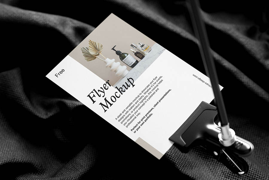


The single A4 flyer
A single A4 flyer is one flat sheet, 210 × 297 mm — the everyday size most print layouts already assume.
SizesA4, A5, A6
A4 trim210 × 297 mm
FormatFlat, no fold
FilesLayered PSD, smart objects
It's the default flyer size, and that cuts both ways. A4 is also the sheet letters, invoices and forms are printed on, so a flyer starts out looking like paperwork unless the design says otherwise early — an image running off the edges, type at a size no document would use, a colour a laser printer couldn't produce. It's the size for event promos, menus, price lists, notices taped in shop windows and anything pushed through a letterbox.
The A sizes are the convenient part of working here: A4, A5 and A6 all share the same proportion, so artwork scales from one to the next without refitting. A5 is half an A4 and the size that gets handed out at street level; A6 is half again and small enough to survive a pocket. What does change is how the layout reads — A4 is tall and text falls a long way down it, so the middle is where designs tend to go quiet, and two columns come out narrower than they look on screen.
In the sets: held, pinned to a board, stacked, scattered and shot straight down, so you can present the flyer clean or sit it in a real scene. Each is a layered PSD with smart objects — the artwork sits on its own layer, so replacing it leaves the lighting and shadow untouched.


